WHISKY LABEL DESIGN
(Hover Here)
This project started back in September 2019, where a person approached me on Messenger and asked whether I was interested in designing bottle labels for their company.
Being just a student with little to no knowledge or experience in this field, I thought this would be a great opportunity to venture into a type of art I hardly ever thought of.
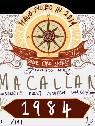
The gallery above shows the progress and development of the first whisky label design. The first sketch of the design was drawn initially to show my design abilities and not intended to start off the project. Who knew, an idea I was playing around with was accepted as the first draft sketch.
There were changes in colours, fonts and words throughout the process as I experimented. Different year variations and possible colour combinations are also shown above.
Inspiration and references - 1st label
Since this was a field I have never explore into before, I decided to start off by visiting nearby wine and liquor stores. Observing the designs, I realised while wine labels have a more sophisticated, elegant and modern type of style, whisky labels often have more rough or vintage retro designs, sometimes stained or conveying a 'used before' look.
Below are some pictures I had taken during my visits:
 Wine Label |  Irish Whisky Design Inspiration |  Whisky Label Inspiration |
|---|
In addition to that, I found some vintage designs and ideas on Pinterest for references as well. The banner and vintage 'leaves' design were the main ideas that caught my eye, as I did not see many whisky labels using those elements.
 Banner design references |  Gold 'leaves' references |  Label Design Inspiration 1 |
|---|---|---|
 Label Design Inspiration 3 |
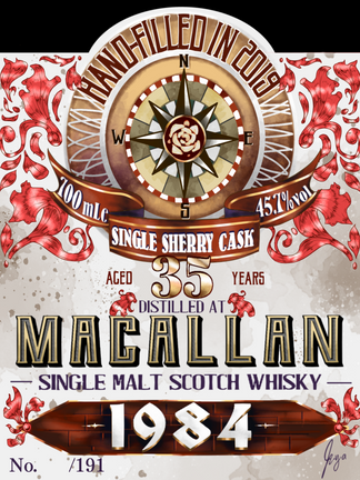
The gallery below shows the process and development of the second whisky label I was asked to design.
Inspiration and references - 2nd label
For the second label, I wanted to use a different colour scheme and make it more luxurious and elegant than the previous one. The first draft (red square design) was a more minimalistic approach. Looking at it now, it would've been more suitable for a wine label instead of a whisky label as it was much simpler and less rustic in design.
The second draft was the accepted one. There was more colour variation with this and the design was more luxurious and appealing than the first draft.
References and inspirations for the second label:
 Whisky Label (2) Inspiration 1 |  Whisky Label (2) Reference |  Whisky Label (2) Inspiration 2 |
|---|
Throughout this project, I continuously communicated with the person in charge and made changes appropriately to their wishes and critiques while making sure my academic studies are not neglected. I have learnt some of the documents (such as quotations, purchasing orders, etc.) and formality involved in such types of commercial commissions. The challenge of this project was learning to manage my time well and come up with designs that are different from other labels.
Overall, it is an exciting (ongoing) project and I learnt time management, how to accept critiques and change, the business side of art and maybe a thing or two about graphic designing. It is a project I never expected to start but I am grateful to have an opportunity like this.


